Case study · Concept redesign · iPhone
The right discount, even offline
A concept redesign of the UAE membership app that connects families to discounts: easier to browse, easier to trust, and a card that works with no signal.
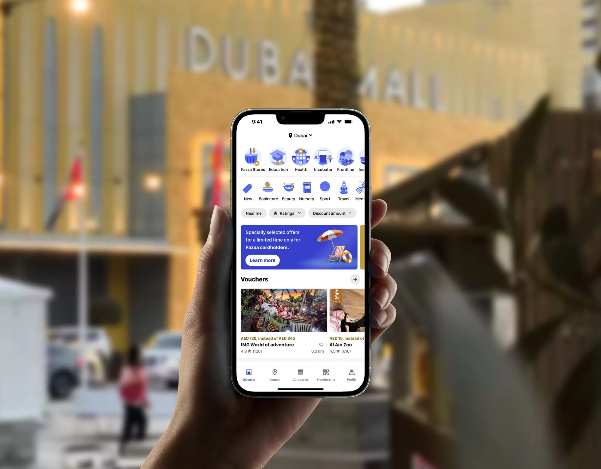
00 Overview
- Problem
- A large catalogue that was hard to browse, discounts hard to trust, a crowded map, and a membership card that failed without a connection.
- My role
- Research, information architecture, wireframes and interface, end to end.
- What I did
- A reorganised catalogue, filters by reviews and by discount size, a calmer map, one screen per venue, and the card’s QR code in the phone’s wallet.
- Outcome
- A concept redesign. In feedback on it, the new filters and the offline card stood out.
01 Context
A membership worth thousands of offers
Fazaa is run by the Social Security Fund of the UAE Ministry of Interior. Its members, more than 370,000 government employees among them (Zawya), use the app to find discounts on brands, stores and services.
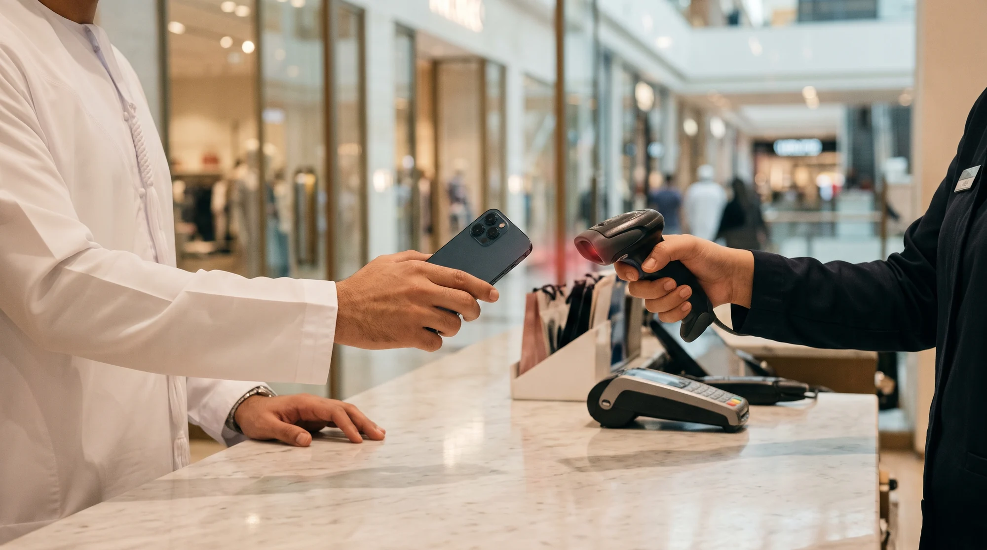
The app does one job in two moments: choosing where to go, at home, and showing the card’s QR code for the cashier to scan, at the counter.
Who it’s for
- Families planningBrowse offers for the weekend, by category and by place.
- Members at the counterNeed the QR code ready for the cashier’s scanner at once, signal or not.
- Members comparingWant to know an offer is good before they go.
02 Research
Method
- 15 interviewsThe source of the four problems below.
- The app, used for realMy own use of the app, task by task, alongside the interviews.
- 3 personasThe members the redesign was built for, drawn from the interviews.

What it showed
The interviews and my own use pointed to the same four problems.
- Finding a venue was hardCategories and services were cramped and confusing.
- Discounts were hard to trustNo reviews and no way to filter: every offer looked the same.
- The map was crowdedPins piled on top of each other where venues were close.
- The card failed offlineThe one thing shown at the counter needed a connection, often where there was none.
03 Define
The question
How might Fazaa be clear to browse, easy to trust, and useful even with no signal?
Principles
- Structure before screensFix how the catalogue is organised first. Screens follow.
- Trust needs evidenceReviews and the size of the discount, visible before choosing.
- The card never failsAt the counter, with or without a connection.
- One screen to decideEverything about a venue in one place.
How success would be measured
- Finding
- Time to find a venue for a given need, before and after
- Trust
- Share of offers chosen after using the filters
- The card
- Card opens at the counter, with and without signal
04 Explore
Structure first
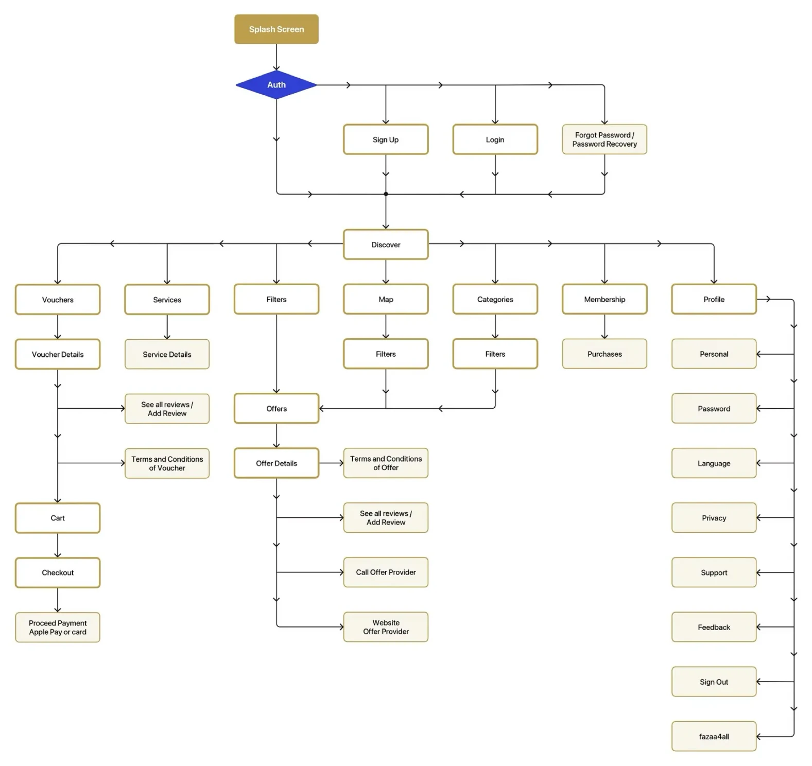
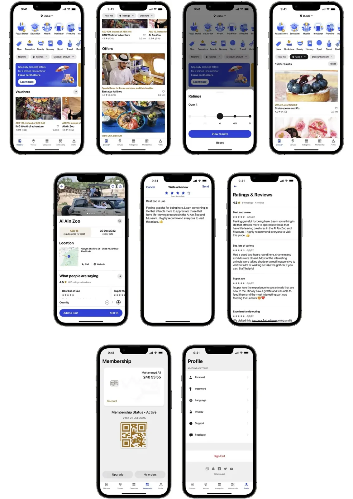
Before any screen, the catalogue was reorganised: categories and services laid out with room for quick recognition, and every venue’s details gathered on one screen instead of spread over several. Then wireframes for each part of the new structure.
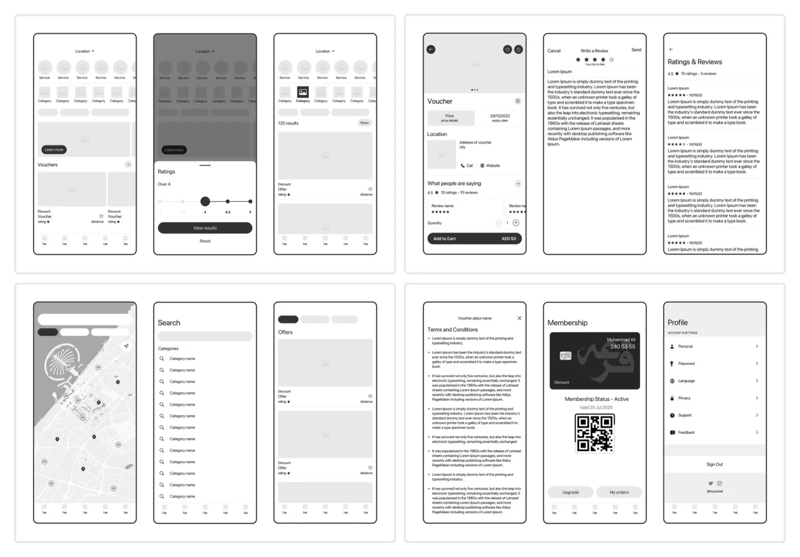
Key decisions
- Categories with room to breatheRecognised at a glance instead of read one by one.Before: cramped, confusing categories
- Filters people asked forBy reviews and by the size of the discount.Before: no way to filter
- A calmer mapPins grouped where venues are close, with category filters.Before: pins piled on top of each other
- One screen per venueOffer, reviews, place and hours together.Before: details over several screens
- The QR card in the phone’s walletThe cashier scans it with no signal and no app to load.Before: a card that failed offline
05 Design
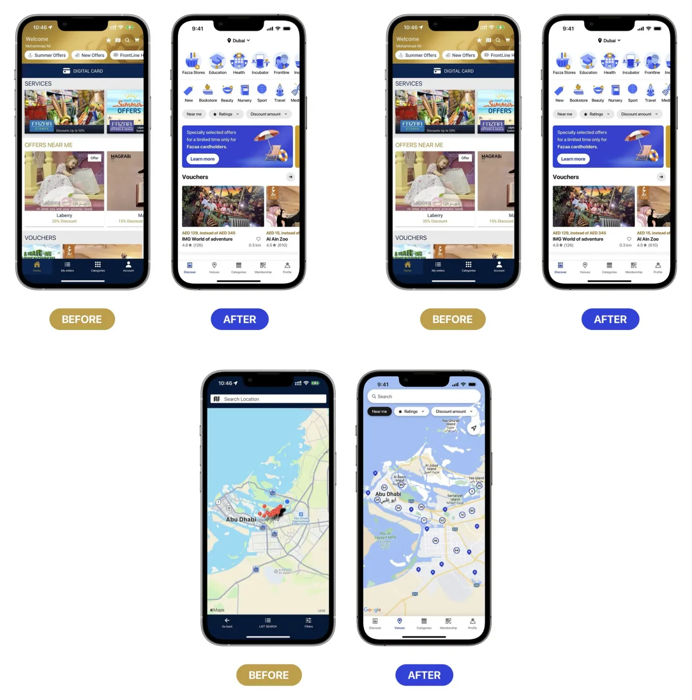
Before and after
The home screen leads with categories that can be recognised at a glance, and the map groups close venues into one pin with a count, splitting as you zoom in.
From discovery to the card
A venue’s screen holds everything needed to decide: the offer, reviews, the place and the hours. The membership card is one step away. Its QR code lives in the phone’s wallet, ready for the cashier’s scanner.
06 Details
Edge cases the design handles
- No signal at the counterThe QR code lives in the phone’s wallet and opens without the app.
- Many venues close togetherOne pin with a count. Zooming in splits it.
- Too many offersFilters by reviews and discount size narrow the list.
Accessibility: what I’d check now
- Gold accentsGold on white needs checking against contrast rules wherever it carries text.
- Arabic, right to leftAn app for the UAE: every screen designed again in Arabic.
- Larger textCategory tiles still readable at the largest text sizes.
07 Result
In feedback on the concept, the new filters and the offline card stood out: the first is what makes a discount worth trusting, the second is what makes the membership usable at all.
- Next: test the new structure on its own, with a tree test, before any visual design.
- Measure the time to find a venue in the current app and the redesign.
08 Reflection
With a large catalogue, the structure matters more than any single screen. And a feature people rely on in the moment has to work under every condition, signal or not.
What I’d do differently: share the structure with members before drawing screens, and design the Arabic version alongside the English one from the first wireframe.